Everyone's making mountain-inspired logos in 2026 — a trend that reveals a lot about the enduring appeal of this simple, yet meaningful symbol. A mountain is more than just a triangle; it’s a representation of permanence, aspiration, and adventure. It’s no wonder the mountain has been a staple in logos for decades, from the abstract homage of The North Face to the specific peaks of Toblerone and Coors Light.
What sets the recent logos apart, however, is their specificity. The Utah Mammoth’s crown of peaks is a subtle nod to the Wasatch Mountain Range, while Vermont’s wordmark smuggles in the real Camel’s Hump, a peak that stands proudly in autumn. Mountain Dew has leaned into its heritage with a mountain backdrop that evokes 20th-century travel posters. These details give each logo a unique personality that resonates more deeply with audiences.
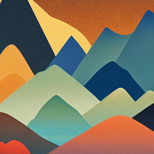
Alpes 2030’s abstract logo is an exception, but even here, the colour palette grounds the design with the alpenglow of the Alps. The key is that a mountain is one of the most tangible symbols you can use in design. You can’t fake the Wasatch Range, and its presence in a logo is a testament to the enduring power of nature in our culture.
So, why does this matter? In a world where AI can generate anything, a mountain is a symbol that is rooted in reality. It’s not just a logo; it’s a reminder that, no matter how much the world changes, the mountains and rivers remain. This trend in logo design speaks to our deep connection to the natural world and our desire to reflect that in our everyday symbols.