Colour is one of the most powerful tools in an artist's arsenal, shaping emotions and guiding viewers through their work. From creating harmony with simple hues to crafting complex narratives with temperature contrasts, understanding these 14 concepts can elevate your art.
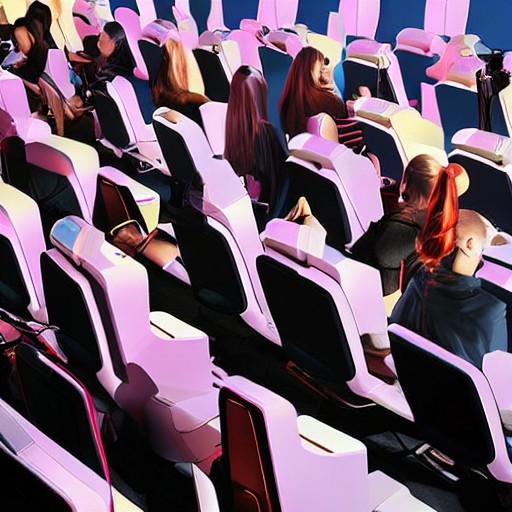
Incorporating simplicity and rest ensures that the core message is clear, while colour framing guides the viewer’s eye towards key elements. Cold blues and warm yellows tell their own stories, each with a unique impact on the piece's overall mood. The temperature of light sources influences not just appearance but also the emotional response it elicits.
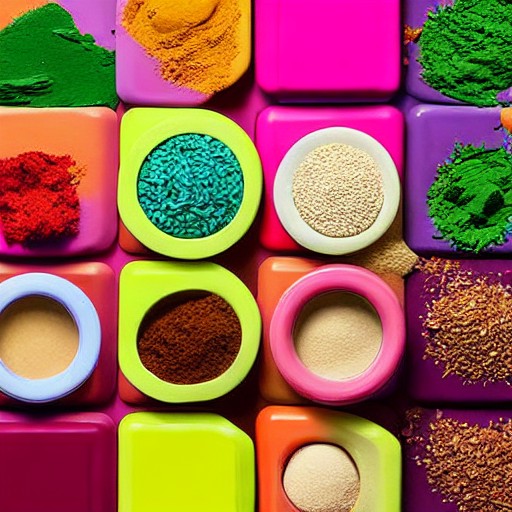
Using colour as rhythm adds dynamic movement to your work, much like the beats in music. From heavy metal's harsh staccato to bossa nova’s smooth transitions, each hue carries its own narrative. Local versus light colour demonstrates how the surrounding environment can dramatically alter an object's appearance, making for a more nuanced and engaging composition.
Grouping colours together or using gradients can help focus attention on specific areas, while exclusivity ensures that certain elements stand out by being unique. These techniques aren't just about aesthetics; they’re key to storytelling in the visual arts.