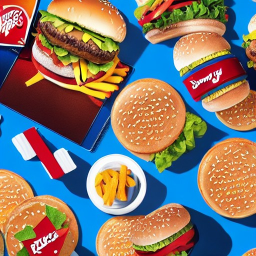
Five years on from its groundbreaking rebrand, Burger King continues to dazzle with a design that marries retro charm and modern flair. The overhaul, led by JKR, saw the fast-food giant discard the glossy 1999 logo in favour of a simpler, bolder version reminiscent of its 1969 roots.
The new logo, coupled with a fresh custom typeface called ‘Flame’, created a clean, contemporary look that felt both digital and homely. This shift aimed to counteract negative perceptions of fast food by making the brand feel more authentic and appealing.
By anchoring itself in its heritage, Burger King managed to create a system that feels both timeless and contemporary. Its success lies in treating its past as raw material rather than a rigid template, leading to a rebrand that has aged gracefully while staying relevant.
This approach stands in stark contrast to the many brands that have struggled with rebrands that quickly become outdated. As we see more companies rediscovering their archives, Burger King's strategy remains a beacon of how to blend nostalgia and modernity seamlessly.