How LA28’s bold, city-inspired typefaces are redefining Olympic branding. Monotype’s Charles Nix discusses how typography captures cultural diversity and creates a living identity for the host city.
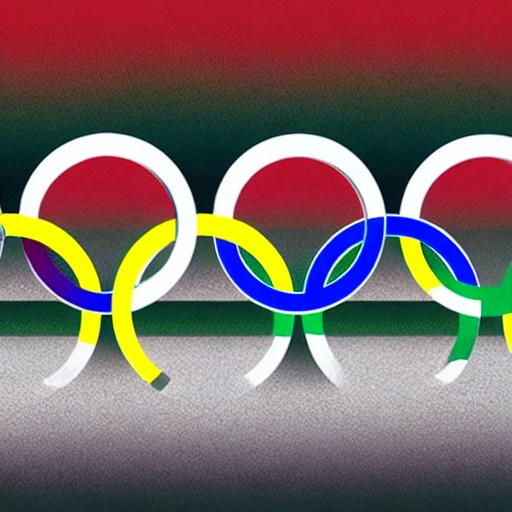
The LA 2028 Summer Olympics brand is a striking example of design that reflects the city’s soul. Its variable ‘A’ logo and neighbourhood-specific typographic styles celebrate LA’s rich, heterogeneous landscape. Typography isn’t just supporting this identity; it is the identity itself – systematic yet alive, functional yet expressive.
Charles Nix explains how flexibility in typography creates a balance between global reach and local relevance. He argues that a flexible system can hold multiple voices without becoming chaotic, much like LA itself. This approach ensures that cultural nuances are preserved while maintaining coherence on a broader scale.
Typography’s role extends beyond mere representation; it becomes a living part of the city, reinforcing and extending its identity through everyday use. As the LA28 identity demonstrates, this flexible typographic system can serve as an effective tool for urban preservation and cultural expression without sacrificing diversity.