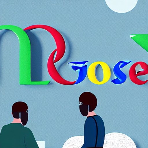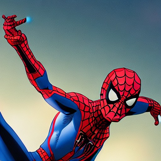
Who knew a simple line could spark such division among Spider-Man enthusiasts? As anticipation builds for Spider-Man: Brand New Day, the latest logo has fans divided. The new design, which finally gives us a glimpse of unmasked Tom Holland, has drawn criticism over its leg connections.
One disgruntled fan took to Twitter, stating, 'I don’t like how the top legs connect to each other.' Previous iterations featured more pronounced leg designs, but this new condensed look seems to have upset many. One fan tried to defend it, suggesting, 'It’s not intentional logo design, it’s just the web running behind the logo,' only for another to respond, 'Oh I see it now, thanks. But honestly, I feel like that makes it even weirder?'
The controversy extends beyond casual observers; graphic designers chimed in, with one agreeing, 'As a Graphic Designer I agree, has to be a reason!' The divide among fans highlights how deeply personal these logos are, evoking nostalgia and emotion tied to the character's iconic history.
For those interested in more Spider-Man developments, check out why the Brand New Day trailer launch was so genius or test your skills with our superhero logo quiz. Stay tuned for updates from Creative Bloq as we continue to bring you the latest news and inspiration from art, design, and technology.