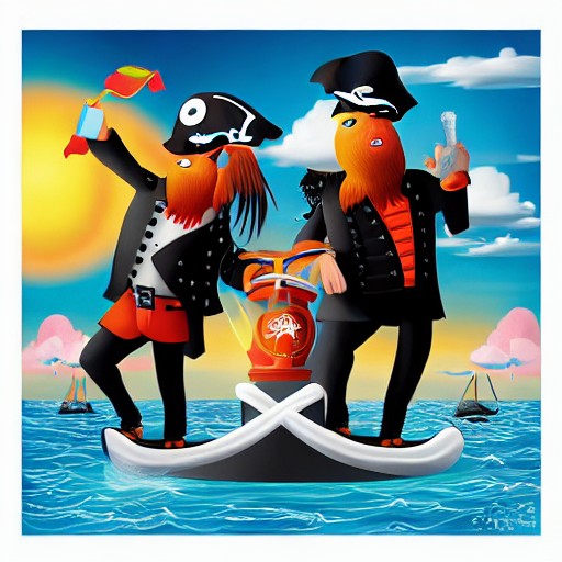
When Pirate's Booty unveiled its new logo, the internet's reaction was swift and scathing. Critics argue that the modernised design strips away the brand’s nautical charm in favour of generic sans-serif typography and an overly polished look.
The old logo, with its playful parrot-shouldered pirate and charmingly scrawled font, had a distinct personality that made it stand out among snack brands. The new version, however, seems to lack the pizazz, with a cartoonish pirate in a clipart-style pose and a modern comic coloring problem that diminishes its visual appeal.
Redditors were particularly vocal about the downgrade, pointing out the ‘AI trash’ style of the logo and the unrealistic shading issues. One critic noted: 'Picture is in the AI trash style, but nothing to give it away one way or the other. Either way, it is a pointless downgrade on the graphic design front.'
This rebranding debacle joins a long list of failed modernisations, from Cracker Barrel's confusing menu updates to Jaguar’s misguided redesigns. While some may see the new logo as just another inoffensive attempt at contemporary branding, others find it lacking the spirit that made Pirate's Booty beloved.