This new logo for the Association of Applied Paleontological Sciences (AAPS) is a radical departure from traditional design norms. Straddling minimalist contemporary aesthetics with a grungy, archival vibe, it challenges every rule of logo creation yet succeeds in its narrative.
Grant Sanders of SAND Agency was tasked with modernising the AAPS identity while honouring its academic roots and commercial relationships. The resulting design, with multiple typefaces and complex textures, may sacrifice legibility for character. However, it immerses viewers in a scholarly world, evoking an archive experience that resonates deeply.
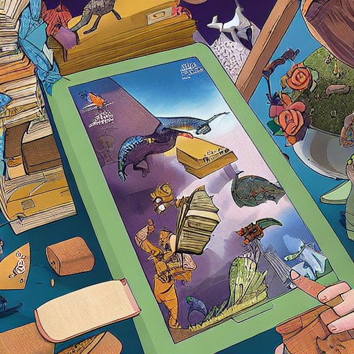
The logo’s versatility lies in its adaptability; there's even a separate avatar for social media. The stencil font 'AAPS' stands out with a rugged personality, while the 'Specimen No.' is a clever nod to the organisation’s history and founding year. This blend of old and new creates a compelling visual narrative that defines AAPS as both timeless and modern.
While the design might struggle in certain contexts, it excels in storytelling. The slightly aged cream background, hand-applied blue script font, and detailed dinosaur illustration all contribute to an immersive experience. For those who appreciate breaking the mould, this logo is a fascinating experiment that challenges convention without compromising on meaning.