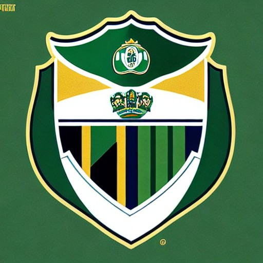
Sporting Clube de Portugal has unveiled a fresh new brand evolution that pays homage to its 120-year legacy while embracing contemporary flair. The club’s new identity is designed around five core symbols: the Porta 10-A, the Stripes, the Shield, the Crown and the Lion.
Created in collaboration with JKR, a global branding agency, the new logo centres on these elements to create a visual expression of Sporting CP's Code. The design includes an elegant pattern inspired by the club’s iconic entrance gate, the Shield drawing on heritage, and the Crown representing the SCP acronym in a contemporary font.
Sean Thomas, JKR’s global executive creative director, explains that 'our job was to build a brand system that carries the spirit of Sporting CP forward without limits.' The lion symbol represents the club's fans, while green and white stripes inspire dynamic motion design. This rebranding aims to remain true to the club's legacy while attracting a new generation.
For more on creative branding, check out this logo design that breaks all rules (and still works) or Polaroid’s provocative anti-AI billboard.