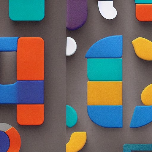
Allan Peters, a daring designer, has once again stirred up the creative community by attempting to ‘fix’ the iconic Disney+ logo. The simplicity of his design – making the letter 'D' the focal point while enhancing the hidden plus sign within – has caused mixed reactions among fans and creatives alike.
The controversy stems from the perception that classic designs should remain untouched, with some arguing that the original must be revered like a holy text. One commenter on Instagram wrote: ‘The Disney D is just too iconic to change,’ while another passionately declared: “There is literally only one rule. NEVER touch Disney. EVER.”
For those who wish to explore more design debates, Creative Bloq's daily newsletter offers insights into why logo controversies often aren’t about the actual design at all but rather the cultural significance of these symbols.
Despite the backlash, Peters’ redesign showcases a clever take on an established logo. However, it also serves as a reminder that sometimes, in the world of design, there are rules so deeply ingrained they become almost sacred.