No, Vermont's new logo design isn't Comic Sans. Created with DNCO, it draws inspiration from the state’s natural and cultural attractions, with a clear, welcoming wordmark that looks simple but evokes wanderlust.
Research found that people already had a lot of love for the state but that this wasn't reflected in trip intention. As a result, the branding aims to present concrete reasons to visit, such as Vermont's high density of artists and writers and its pioneering farm-to-table movement before it became trendy.
The logotype was crafted with the lettering artist Rob Clarke, inspired by Vermont’s tradition of hand-lettered signs on roadsides. The 'e' is a meandering road, the 'm' represents the state's famous hills, and the 'o' is the moon beyond. The design also nods to the state government's logo but with a much friendlier vibe.
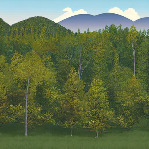
A single typeface in varying weights was chosen to convey a wide emotional range, while the colour palette was built around hues inspired by Vermont’s famed six seasons. The photography and graphic design highlights the state's natural landscapes and activities like skating on all-natural ice rinks.
The resulting system aims to inspire more visitors to explore Vermont's green mountains and unique culture, but some are still unsure about its appeal. Does it work? Only time will tell if clearer branding can truly boost tourism in this picturesque state.