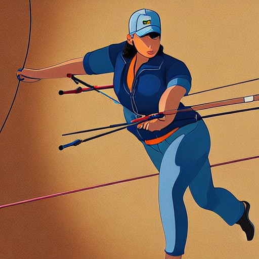
The Archery World Cup has undergone a dramatic rebrand, with striking new visuals aimed at capturing the excitement of its competitions. Designed by Arecibo, this overhaul includes dynamic motion graphics, a customised typeface and a dual-colour palette that offers flexibility while maintaining brand consistency.
With the focus on both the athlete's performance and the audience experience, World Archery hopes to elevate the sport beyond its traditional niche. The 'Can’t Miss' slogan encapsulates this vision, ensuring every element of the rebrand communicates the high stakes involved in each shot.
The new logo, a stylised icon with stepped edges, is versatile yet impactful, allowing for various applications from promotional materials to stadium design systems. A custom variable typeface further enhances the brand's visual identity, providing an expressive aesthetic that ties back to the sport’s roots.
By creating modular kits and editable content templates, World Archery aims to ensure a seamless experience across all venues while giving each location its unique flair. This approach not only aligns with modern branding principles but also makes it easier for host cities to participate in this prestigious event.