The Monster Munch rebrand is a testament to the enduring appeal of classic mascots. From its pickled onion origins, this British crisps brand has remained a staple for over four decades, proving that simplicity and recognisability are key.
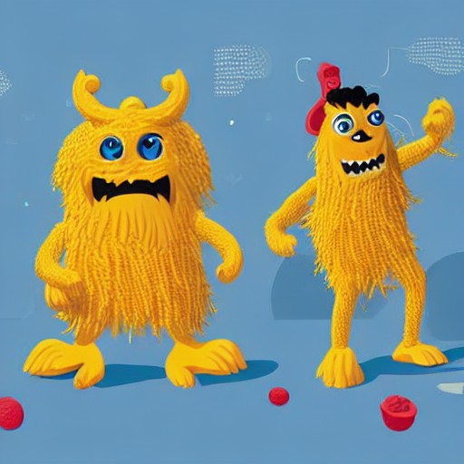
Since 1977, the monsters have been a constant presence in the brand's identity, evolving but never straying far from their original charm. The latest redesign by PepsiCo’s European design team reintroduces these characters as stars, stripping away modern distractions to highlight the brand's nostalgic appeal.
Jon Bailey of PepsiCo explains that the cautious approach was crucial for maintaining the legacy and recognisability of the monsters. The new design retains the distinctiveness of each character while making a bold statement about the brand’s enduring popularity.
The rebrand also marks a return to more subtle branding, reducing reliance on the broader Walkers portfolio. This decision underscores the importance of individual brand identity in today's crowded market.
As for the shape of the crisps? They remain as mysterious as ever, leaving fans to ponder whether they symbolise paws or a single eye. The answer may lie in the enduring mystery of brand mascots themselves.