Calendly has finally bid farewell to its controversial toilet bowl-inspired logo. Now, its refreshed branding aims to reflect the company’s growth into a comprehensive productivity suite.
The design studio Smith & Diction crafted an intentionally softer approach, with a single asymmetrical ripple around the 'C' symbolising the 'ripple effect' of scheduling meetings. The wordmark is cleaner and more structured, meant to represent the brand as an invisible connective tool for users.
Moving away from neon colours, the new palette focuses on simplicity and effortlessness, with hues that gently transition into each other. Subbrand icons also incorporate 'gloop' to soften connections internally, making them easily identifiable.
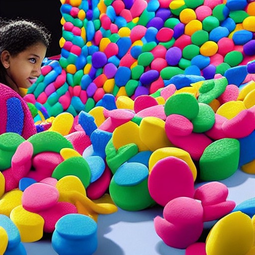
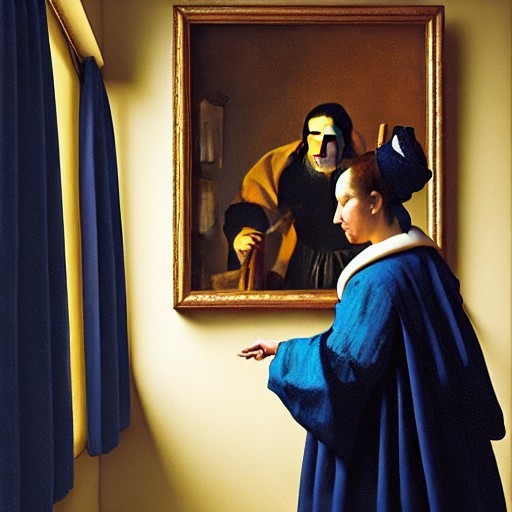
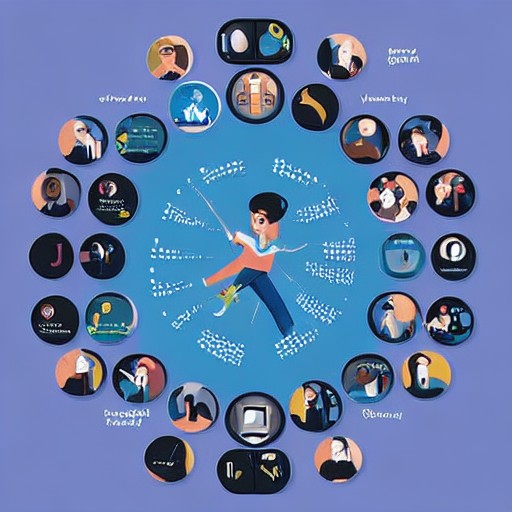
While AI-generated visuals add a dreamy touch, they remain uncharted territory for the studio. The result is a brand update that feels more mature and versatile, ready to support not just scheduling but broader productivity needs.