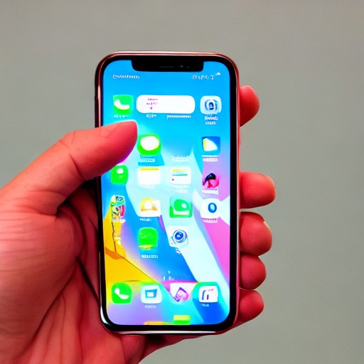
I scroll through my phone, sipping an overpriced espresso tonic at a San Francisco café. Apple’s new ‘More Clear’ setting for iOS 27 distorts the edges of notifications, much like how the glass in my hand refracts the coffee's colors.
With iOS 27, users can adjust Liquid Glass to be even more transparent than its default setting. In the public beta, this choice is available under Settings > Appearance. The more you drag it left, the clearer your phone becomes, with names of Slack rooms curling into meaningless lines as I scroll.
This ‘more clear’ option adds an increased depth to my device, reminiscent of the parallax wallpaper effect from iOS 7. Both Liquid Glass and 3D app icons gave the iPhone a more tactile sense of dimensionality, making it appear three-dimensional in some ways. I experienced a similar 'dive-in quality' when I cranked up the transparency of Liquid Glass.
Halfway through my week of testing, this option started to look so normal that I worried I had accidentally reset my phone to default settings. The legibility impact was minimal; often, I noticed Liquid Glass warping words and colors out of the corner of my eye as I used my iPhone.